Bar chart with confidence intervals
Publication-ready bar chart with {ggplot2}
I haven’t posted anything useful in a while so I decided to make a post that will hopefully be super useful for folks that need to create barcharts.
I’ve had to make many presentations in front of clients that wanted to see bar charts with confidence intervals so the code that I’m sharing isn’t something that I randomly threw together this weekend; I actually used the code several times to generate publication-ready bar charts.
Simple Bar Chart
Data context: displaying % of patients receiving treatment X from 2015 to 2020
Let’s first load in the packages
library('pacman')
p_load(ggplot2, ggrepel, dplyr)
Below is the data that I’ve generated as an example
set.seed(1234)
df <- tibble(
  year = 2015:2020,
  prop = 18:23/100,
  prop_low = prop-0.01,
  prop_hi = prop+0.01,
  proptxt = paste0(sprintf("%0.1f",prop*100),"%"),
  Region = "All Regions",
  Total = sample(1000:2000,6),
  Totalpretty = prettyNum(Total, big.mark=",")
)
Now let’s generate the barchart.
# Specify font if on windows
# windowsFonts(A = windowsFont("Times New Roman"))

# Use data
df %>%
  # y is our proportion x is the year
  # There's only one region in our data but if other regions are included, we could specify them
  ggplot(., aes(y = prop, x = year, colour = Region, fill = Region, group = Region)) +

  # Use geom_bar() and geom_errorbar() to specify the high and low of the confidence intervals
  geom_bar(stat='identity', width = 0.5) +
  geom_errorbar(aes(ymax = prop_hi, ymin = prop_low), colour="black", position = position_dodge(0.1), width=.3) +
  # Use black and white theme
  theme_bw()  +

  # Specify the major and minor bfeakpoints
  scale_y_continuous(labels = scales::percent_format(accuracy = 1L),breaks = seq(0,0.25,0.05), minor_breaks = seq(0.1,0.25,0.05), limits = c(0,0.25))+

  # Include total in the labels
  scale_x_continuous(breaks = c(2015:2020),minor_breaks = c(2015:2020), labels = paste0(2015:2020, "\n(N=", df %>% select(Totalpretty) %>% pull,")")) +

  # Include X and Y Label
  labs(colour = " ", fill = " " , y="Percentage of patients receiving X (%)", x= "Year") +

  # Specify the labels position and font
  geom_text_repel(size = 4, aes(label=proptxt, family="A", fontface=2), nudge_x = 0.00, nudge_y = 0.020, show.legend = FALSE, max.overlaps = Inf, point.padding = 0, min.segment.length = Inf) +

  # Specify the fill color
  scale_fill_manual(name = "", values = "#F8766D") +

  # Remove Legend
  # theme(legend.position = "none", text = element_text(family = "A", size = 15))
  theme(legend.position = "none", text = element_text(size = 15))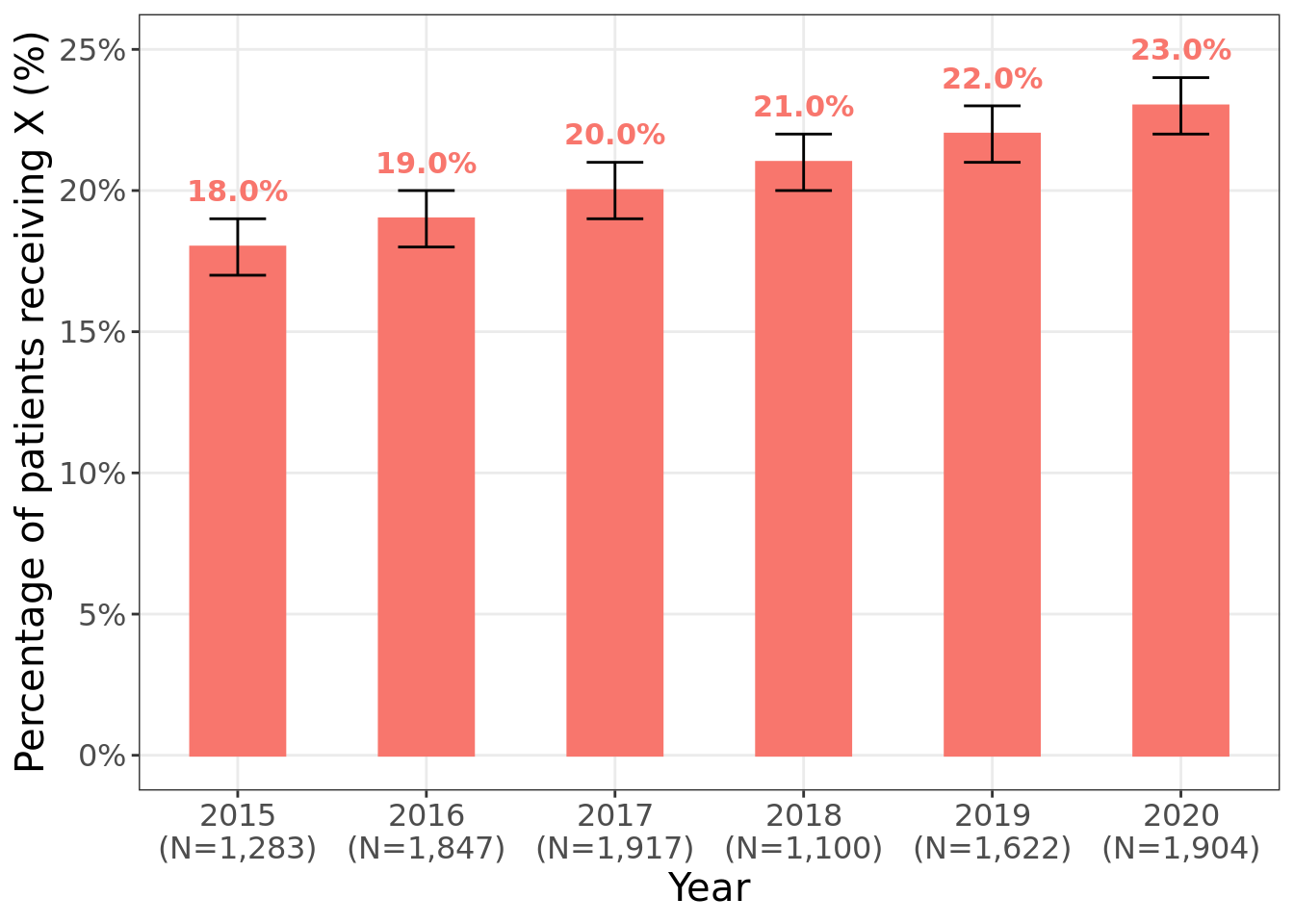
Clustered bar graph
Data context: Displaying Change in % of patients receiving X
Let’s generate new data to specify clusters based on region
## This will be data for a clustered bar graph
set.seed(1234)
df <- tibble(
  year = rep(2015:2020, times = 4),
  prop = sample(10:23,size = 24,replace = TRUE)/100,
  prop_low = prop-0.01,
  prop_hi = prop+0.01,
  proptxt = paste0(sprintf("%0.1f",prop*100),"%"),
  Region = rep(c("West","Midwest","South","Northeast"), each=6),
  Total = sample(1000:2000,24),
  Totalpretty = prettyNum(Total, big.mark=",")
)
Now let’s create the clustered bar graph
# Generate Bar Figure ------------------------------------------------

# Specify font
# windowsFonts(A = windowsFont("Times New Roman"))

df %>%
  # factorize the region variable
  mutate(
    Region = factor(Region, levels = c("West","Midwest","South","Northeast")),
    labx = year,
    laby = prop,
    year = factor(year)
  ) %>%
  ggplot(., aes(y = prop, x = Region, fill = year)) +

  # If error bar not visible for some points in the figure, increase width to 0.5
  geom_bar(aes(fill = year), stat="identity", position="dodge", width = 0.9) +
  geom_errorbar(position = position_dodge(0.9), aes(ymax = prop_hi, ymin = prop_low, group = year), colour="black",  width=.3) +

  # Specify y axis breaks
  scale_y_continuous(labels = scales::percent_format(accuracy = 1L), breaks = seq(0,0.4,0.05), minor_breaks = seq(0,0.4,0.05))+

  # Remove background image of figure
  theme_bw()  +

  # Include X and Y axis label
  labs(colour = " ", fill = " " , y="Percentage of patients receiving MNA (%)", x= "Census Region") +

  # Specify label such that non of them overlap, might want to comment this and manually add labels using poweroint
  geom_text_repel(size = 4, aes(label=proptxt, family = "A", fontface = 2, colour=year), show.legend = FALSE, position = position_dodge2(0.9)) +
guides(colour = guide_legend(nrow=1)) +

  # Specify the fill colors for the bars
  scale_fill_manual(name = "", values = blues9[4:9]) +
  scale_colour_manual(name = "", values = blues9[4:9]) +

  # All legend in one row
  guides(fill = guide_legend(nrow=1)) +

  # Label bottom
  # theme(legend.position = "bottom", text = element_text(family = "A", size = 15))
  theme(legend.position = "bottom", text = element_text(size = 15))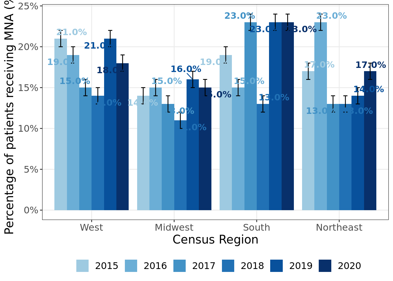
I hope this was helpful. Generating figures for clients can be somewhat tedious to code but will be absolutely worth it once you’ve been coding the figures for a while! Good luck to everyone who needs to do so!
Chong H. Kim
Health Economics & Outcomes Researcher
My research interests include health economics & outcomes research (HEOR), real-world evidence/observation research, predictive modeling, and spatial statistics.