Timeline Graph
Timeline graphs… extended!
So, I was checking a few online forums and I found someone asking about replicating a timeline graph and I got super interested in doing so because sometimes clients may want to visualize milestones in a way that isn’t tabular. A few resources that I came across are from Ben Alex Keen’s Site and Stack Exchange for identifying preservation of dates using ifelse() and if() function and lastly Data Nova.
Let’s dive into creating a timeline graph then.
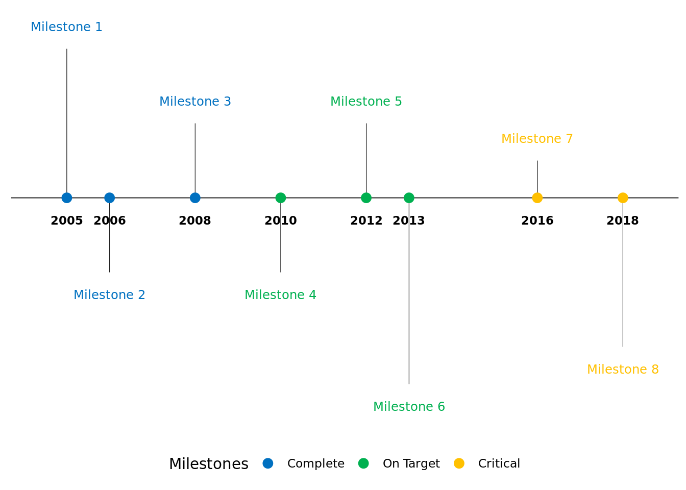
Situation: Yearly Timeline Graph
There are situations when you only want to show yearly milestones… Let’s load some packages first.
library(ggplot2)
library(scales)
library(lubridate)
##
## Attaching package: 'lubridate'## The following objects are masked from 'package:base':
##
## date, intersect, setdiff, unionlibrary(dplyr)##
## Attaching package: 'dplyr'## The following objects are masked from 'package:stats':
##
## filter, lag## The following objects are masked from 'package:base':
##
## intersect, setdiff, setequal, unionlibrary(ggrepel)We’re going to generate a timeline graph from 2005 to 2018. There will be 3 milestones (Complete, On Target, and Critical). Below is the data structure and vectors that need to be created
# Specify status colors and levels
status_colors <- c("#0070C0","#00B050",'#FFC000')
status_levels <- c("Complete","On Target",'Critical')

# Generate dataframe
milestonedf <- data.frame(
  year = c(2005, 2006, 2008, 2010, 2012, 2013, 2016,2018),
  milestone = paste0('Milestone ',1:8),
  status = c(rep(status_levels[1],3),rep(status_levels[2],3),rep(status_levels[3],2)),
  direction = rep(c(1,-1), 4)
) %>%
  mutate(
    # specify status as factor
    status = factor(status, levels = status_levels),
    # Specify y-direction for milestone
    position = sample(c((1:5))/20,8,  replace = TRUE)*direction,
    # Specify text position
    text_position = 0.03 * direction + position
    )
It’s important to specify the status as factors because we want the specific order of the factors for the status variable.
Let’s create the graph now!
ggplot(milestonedf,aes(x=year,y=0, col=status, label=milestone)) +
  labs(col="Milestones") +
  scale_color_manual(values=status_colors, labels=status_levels, drop = FALSE) +
  theme_classic() +

  # Plot horizontal black line for timeline
  geom_hline(yintercept=0, color = "black", size=0.3) +

  # Plot vertical segment lines for milestones
  geom_segment(data=milestonedf, aes(y=position,yend=0,xend=year), color='black', size=0.2)+

  # Plot scatter points at zero and date
  geom_point(data = milestonedf, aes(y=0), size=3) +

  # Don't show axes, appropriately position legend
  theme(axis.line.y=element_blank(),
        axis.text.y=element_blank(),
        axis.title.x=element_blank(),
        axis.title.y=element_blank(),
        axis.ticks.y=element_blank(),
        axis.text.x =element_blank(),
        axis.ticks.x =element_blank(),
        axis.line.x =element_blank(),
        legend.position = "bottom"
  ) +

  # Show year text
  geom_text(aes(x=year,y=-0.03,label=year, fontface="bold"),size=3, color='black') +

  # Show text for each milestone
  geom_text_repel(data = milestonedf, aes(y=text_position,label=milestone),size=3.2, point.size=NA)  +

  # Expand the graph so that all text are within the figure boundaries
  scale_x_continuous(
    expand = expansion(mult = 0.1)
  )
Situation: Monthly Timeline Graph
There are also situations when you want to show the milestones in a monthly fashion… Let’s load some packages first.
We’re going to generate a timeline graph from November 2020 to Feb 2022. There will be the same number of milestones (Complete, On Target, and Critical) from the previous graph. Below is the data structure and vectors that need to be created
# Generate dataframe
milestonedf2 <- data.frame(
  month = c(1,3,5,6,11,12,1,5),
  year = c(rep(2020:2021, each=4)),
  milestone = paste0('Milestone ',1:8),
  status = c(rep(status_levels[1],3),rep(status_levels[2],3),rep(status_levels[3],2)),
  direction = rep(c(1,-1), 4)
) %>%
  mutate(
    # specify status as factor
    status = factor(status, levels = status_levels),
    # Specify y-direction for milestone
    position = sample(c((1:5))/20,8,  replace = TRUE)*direction,
    # Specify text position
    text_position = 0.03 * direction + position,
    # Specify date
    date = ymd(sprintf('%04d%02d%02d', year, month, 1))
    )
Notice the we’ve only included months where milestones have occured. We also need to make a month and year dataframe where we use those data frames as labels in the figure. We’re adding in 2 months buffer prior to the first milestone and the most recent milestone.
# create month dataframe
month_buffer <- 2
month_date_range <- seq(min(milestonedf2$date) - months(month_buffer), max(milestonedf2$date) + months(month_buffer), by = 'month')
# If we want the label in 3 character
# month_format <- format(month_date_range, '%b')
# If we want the label in numbers
month_format <- as.numeric(format(month_date_range, '%m'))
month_df <- data.frame(month_date_range, month_format)
Notice that there’s a commented section for month_format. If you want to use the Character label for the months, you will need to uncomment that line and use that instead of the line that includes %m in the format argument for the month_format vector. Let’s now generate the year label data frame.
# Create year dataframe
year_date_range <- seq(min(milestonedf2$date) - months(month_buffer), max(milestonedf2$date) + months(month_buffer), by='year')
year_date_range <- as.Date(
  intersect(
    ceiling_date(year_date_range, unit="year"),
    floor_date(year_date_range, unit="year")
  ),  origin = "1970-01-01"
)

# Add next year's label if month buffer includes additional year
year_date_range <- if(
  format(max(milestonedf2$date) + months(month_buffer),'%Y') == format(max(year_date_range),"%Y")){
  year_date_range
} else {
  c(year_date_range, floor_date(max(milestonedf2$date) + months(month_buffer), unit="year"))
}

year_format <- format(year_date_range, '%Y')
year_df <- data.frame(year_date_range, year_format)
Finally, let’s create the monthly timeline graph now!
ggplot(milestonedf2,aes(x=date,y=0, col=status, label=milestone)) +
  labs(col="Milestones") +
  scale_color_manual(values=status_colors, labels=status_levels, drop = FALSE) +
  theme_classic() +

  # Plot horizontal black line for timeline
  geom_hline(yintercept=0, color = "black", size=0.3) +

  # Plot vertical segment lines for milestones
  geom_segment(data=milestonedf2, aes(y=position,yend=0,xend=date), color='black', size=0.2)+

  # Plot scatter points at zero and date
  geom_point(data = milestonedf2, aes(y=0), size=3) +

  # Don't show axes, appropriately position legend
  theme(axis.line.y=element_blank(),
        axis.text.y=element_blank(),
        axis.title.x=element_blank(),
        axis.title.y=element_blank(),
        axis.ticks.y=element_blank(),
        axis.text.x =element_blank(),
        axis.ticks.x =element_blank(),
        axis.line.x =element_blank(),
        legend.position = "bottom"
  ) +

  # Show text for each month
  geom_text(data=month_df, aes(x=month_date_range,y=-0.02,label=month_format),size=3,vjust=0.5, color='blue') +

  # Show year text
  geom_text(data = year_df, aes(x=year_date_range,y=-0.05,label=year_format, fontface="bold"),size=4, color='black') +

  # Show text for each milestone
  geom_text_repel(data = milestonedf2, aes(y=text_position,label=milestone),size=3.2, point.size=NA)  +

  # Expand the graph so that all text are within the figure boundaries
  scale_x_continuous(
    expand = expansion(mult = 0.1)
  )
There you have it folks. There are a bunch of ways that these graphs could be enhanced and incorporated but we won’t go into that now (maybe next post). Hope this helps! Happy coding!
Chong H. Kim
Health Economics & Outcomes Researcher
My research interests include health economics & outcomes research (HEOR), real-world evidence/observation research, predictive modeling, and spatial statistics.